I love to see multiple ways to represent complex data sets. It can generate so many questions for students and it also allows us to identify trends, compare, contrast etc. There is a treasure box of data in Google Public Data. You need to follow this rabbit hole and see what you can see.
Here is the directory for Google Public Data
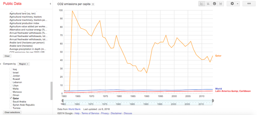
Here are the World Development Indicators like CO2 per capita or education or economic or health indicators. You can compare countries or regions and you can also visualize the data in multiple ways including bar and line graphs, scattergraphs, or on a world or regional map.
 Give it a go and let me know how you use it.