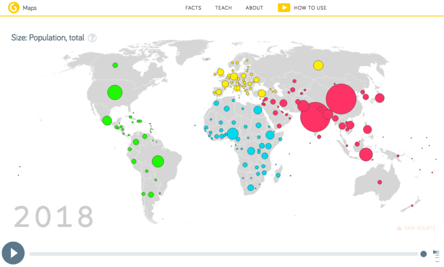
Maps and graphs are very simply put, a visualization of data, numbers and trends. We humans have a hard time interpreting mass quantities of data in our head and often will lose very important trends as it becomes to complex. Gap Minder offers, among many other things, a visualization of income and life expectancy over time for all the countries of the world. 
 This amazing animation sparks so many questions about history, politics, war, healthcare, development etc etc…
It can be paused, watched again, watched in slow motion and dissected in so many ways to better understand the world we live in. Click on any dot to see what country is and the dot is proportional to the population. Watch the massive dip as WW1 and WW2 hit the world. I do not want to share more even though I really want to write all the exciting things that can be done and the amazing question that emerge. Over to you to play and use for deep learning.
What are your thoughts about Gap Minder? What else did you find besides this great graph?
How could you or have you used it for great learning?
Do you have other powerful data visualization sites you use?


This one is a bit dated (mid 2015) and I expect many have watched/interacted with it, but it’s still the best of data viz, in my opinion:
https://io9.gizmodo.com/this-animated-data-visualization-of-world-war-ii-fatali-1709065880
Thanks for the share, great visualization! Mike